Trusted shipping
Easy returns
Secure shopping
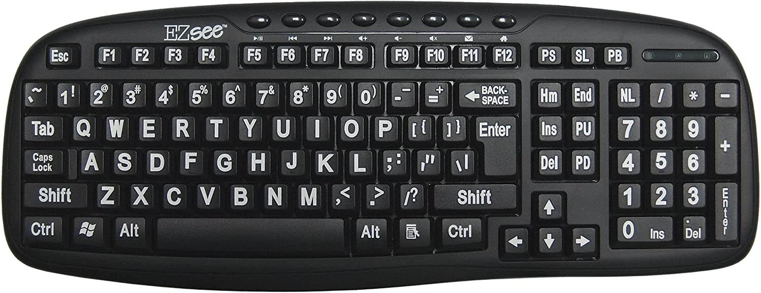
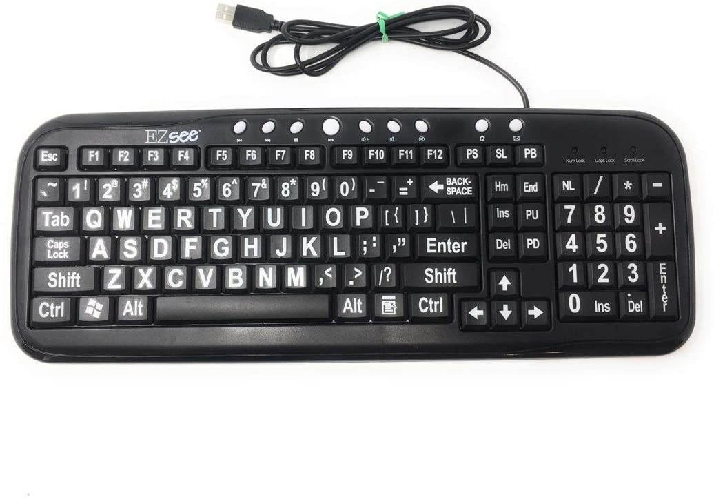
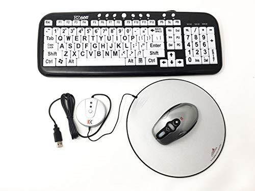
Buy EZsee by DC USB Wired Large Print Keyboard English Standard QWERTY - Black Keys with Bold White Jumbo Oversized Letters/Characters - Visually Impaired. American English in United States - Cartnear.com
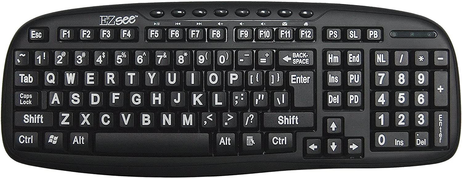
EZsee by DC USB Wired Large Print Keyboard English Standard QWERTY - Black Keys with Bold White Jumbo Oversized Letters/Characters - Visually Impaired. American English
CTNR1725210 CTNR1725210DC
2027-05-07
/itm/ezsee-by-dc-usb-wired-large-print-keyboard-english-standard-qwerty-black-keys-with-bold-white-jumbo-oversized-letterscharacters-visually-impaired-american-english-1725210
USD
98.09
$ 98 $ 100 2% Off
Item Added to Cart
customer
*Product availability is subject to suppliers inventory
SHIPPING ALL OVER UNITED STATES
100% MONEY BACK GUARANTEE
EASY 30 DAYSRETURNS & REFUNDS
24/7 CUSTOMER SUPPORT
TRUSTED AND SAFE WEBSITE
100% SECURE CHECKOUT
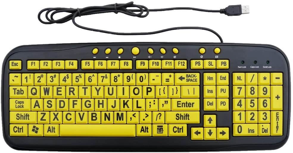
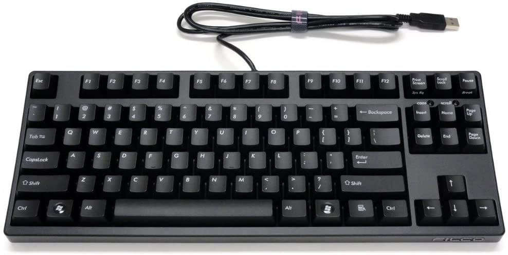
The choice of effective colors used for our Large Print Keyboards is not arbitrary but is guided by innate human visual and cognitive mechanisms. Certain color combination enable better detection and improved legibility of text. Brightness contrast, along with size and viewing distance, is the prime determinant of print legibility. High brightness contrast is created by some color combination but not by others. Black/white and black/yellow are the best custom keyboard combination because they provide the highest brightness contrast. Independent research studies have confirmed by experiments showing black/white and black/yellow produce best legibility. Further, "Positive contrast" is the case of a light object on a dark background such as white print on a black field. In our case, we offer brilliant yellow keys contrast against a black keyboard and black lettering which has proved to be our most popular custom keyboard model for individuals with vision problems. . With letter characters larger than usual and command keys in a larger bolder font, these high-contrast keys can really help those who have trouble seeing keyboards. Perfect for schools, special needs departments and libraries, as well as companies.

